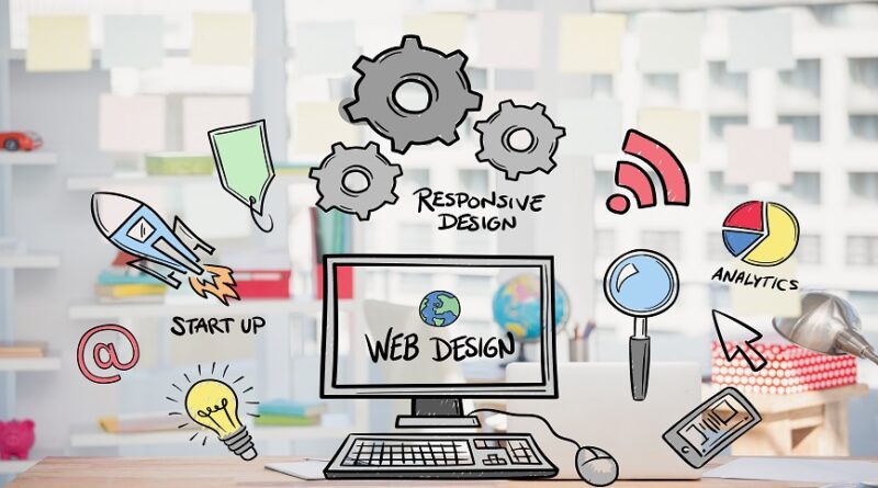
Best Practices for Website Development
It is no secret that technology is increasingly important in our daily lives. Websites are an important component of any business. Nowadays, even drag-and-drop website builders such as WordPress and Wix, which allow non-developers to create simple websites, are available. As a result, hiring web developers is extremely popular.
If you follow these 7 website design best practices, your website will most likely succeed.
1. Target audiences:
The site is more likely to achieve your organization’s goals if you identify and design for your top two audiences. Your content, user interface and experience should be aligned inline with the interest of your target audience.
2. Uncomplicated User Interface:
Your website must be simple to scan and have consumable content. Being mindful of your user’s cognitive burden is a good idea. A riot of colors, graphics, and copy will only serve to overwhelm viewers. Instead, simplify and improve their experience on your website by using a simple layout and only meaningful content.
3. Maintain Consistency:
It is essential so that the audience knows what to expect from one page to the next. Use a consistent color scheme throughout your website design, as well as a menu that links back to all of the main pages. It is also recommended that you keep the typography and graphics consistent throughout your entire site so that clients are not confused about where they are on your website.
4. Great User Experience:
Ensure that one page flows easily into the next, resulting in an easy user experience and avoiding audience confusion. It is advised to include a “contact us” page, as well as a “about us” section and “frequently asked questions pages”. You should also include both external and internal links on your website to help users navigate it.
5. Use Responsive Design:
Responsive design ensures that your website adjusts to your visitors’ browsers and screen sizes. The browsing experience will be the same whether someone accesses your website via smartphone or desktop computer.
It’s also significant because users now spend more time browsing on mobile devices than on desktop computers. This means that a site that is only designed for desktop users will provide a poor experience for a large portion of your potential customers.
With responsive design, you can ensure that all of your visitors have a positive experience. This can cause them to spend more time on your site,
6. Good Readability:
The content on the website should be precise yet engaging. People must be able to easily read the information on your website.
The first step is simply to ensure that your text and background colors contrast well. This will make your text more visible and easier to scan.
Font is also an important aspect of readability. Your font choice has a significant impact on how easy it is to read and skim your content, so choose a clean, easy-to-read one.
While “fun” fonts may be appealing, they are frequently difficult to read. Use simple fonts for body copy and fancy fonts for titles and headings. Your readability can have a significant impact on how users interact with your website. It’s also a simple fix, so if your site is difficult to read, a few quick changes could make a big difference.
7. Accessibility:
The goal of web accessibility is to create a website that anyone, including people with disabilities or other limitations can use. It is your responsibility as a website designer to consider these users in your strategy.
Accessibility, like responsiveness, applies to your entire site: structure, page format, visuals, and both written and visual content.
If you’ve read this far, I hope you’ll find this list useful for your next website Development !


